The following projects were created for GCOM 1813 at Arkansas State University. Each of the projects were created or edited using Adobe CC applications such as Photoshop, Illustrator, and InDesign. Although these were all assignments, it gave me a lot of knowledge I can use for future projects for clients.
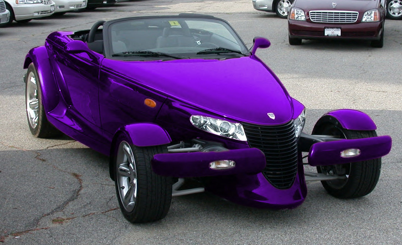
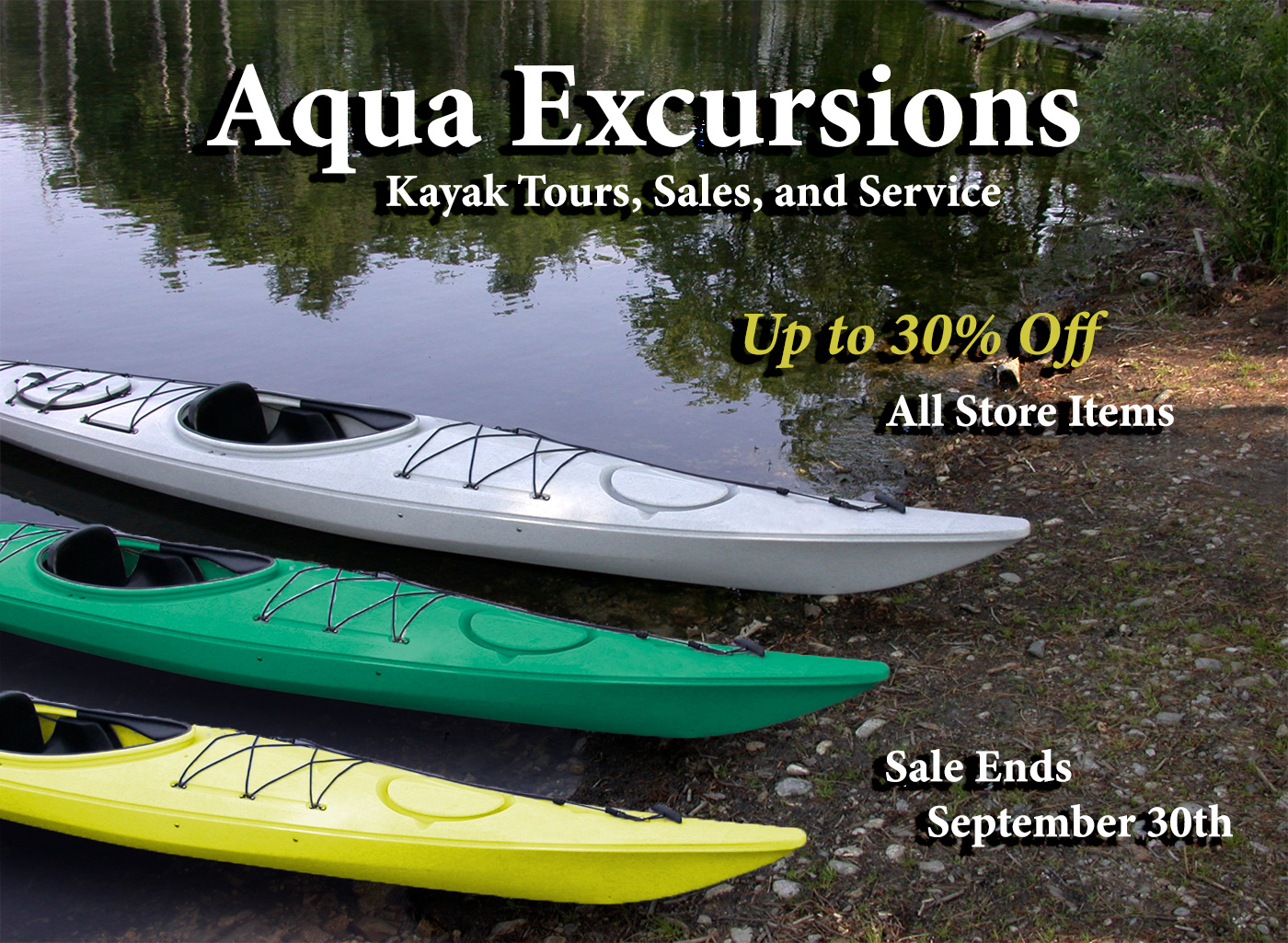
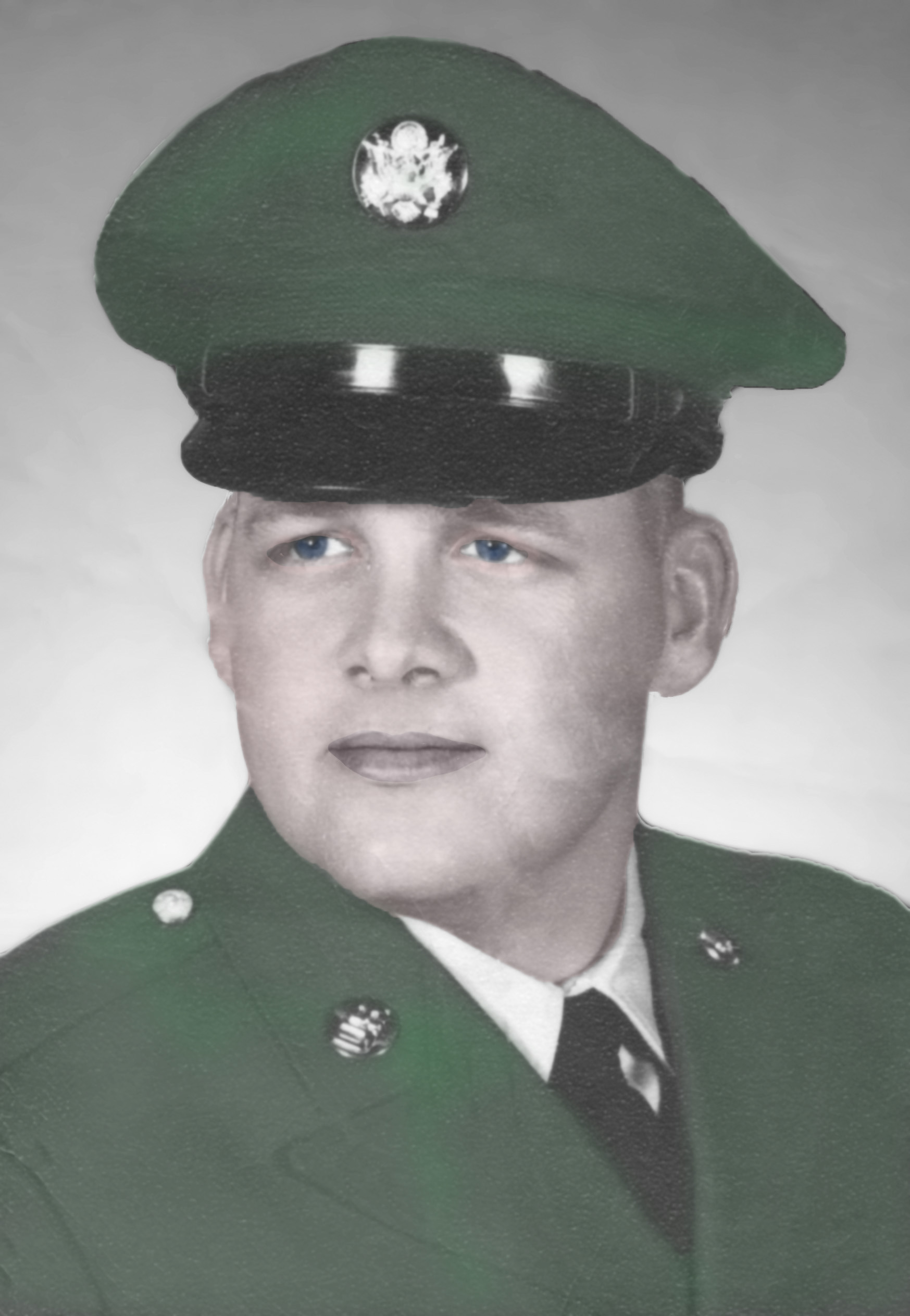
These photos were edited from their original state to the final product using Adobe Photoshop.
Working with Selections:
The Chrysler Prowler started as a black car. I had to outline the car and change the hue to a color of my choice. I managed to get it close to one of Chrysler's most popular colors, Plum Crazy Purple.
Using Layers:
The kayak ad started with just the white kayak. I had to lasso and duplicate it twice and change the color of it. I also had to add the type to make it an ad.
Restored Color:
The soldier started as a worn black and white photo. It had wrinkles and fold marks throughout. I had to restore the picture and give it some color. In order to make it still look like an old photo, I lightly colored his uniform and his facial features.
These files were created using shapes using Adobe Illustrator.
The Lighthouse was created using a triangle, a rounded corner rectangle, a circle, more rectangles, and a large rectangle that was squeezed down at the top to make more of a trapezoid shape. Editing these shapes to give them their form was a fun project.
The playing cards were created by combining numerous shapes. For example, the heart is made of two circles and an upside down triangle. I had to morph the shapes together to create a filler to combine them. The Club is three circles and a triangle, and the Spade is an upside down heart and a triangle. On the Spade, I had to squeeze the sides of the triangle inward to give it more of a finer edge.
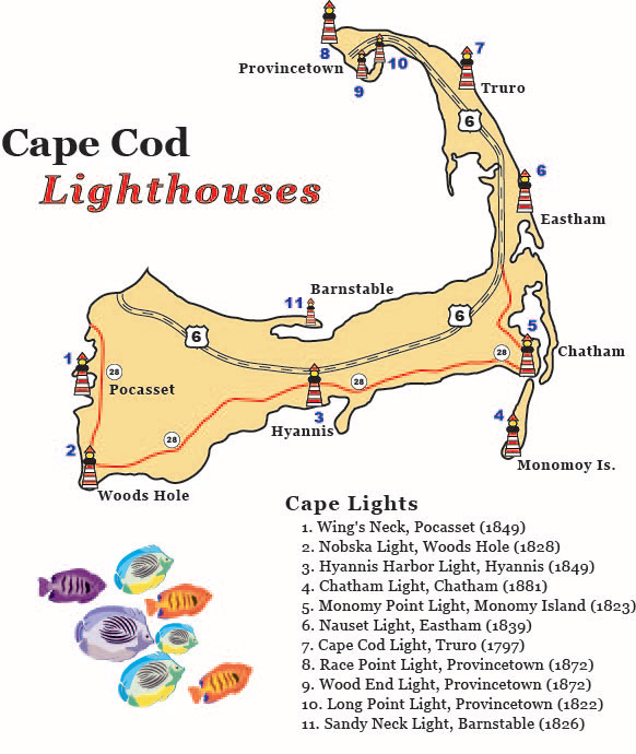
Working with Brushes and Symbols
This project required lots of extra work. I had to create brushes for the roads and symbols for the lighthouse markings, highway markings, and the fish. This project started as a template that I had to trace to get the shape of Cape Cod. The template also told me where to place the symbols and highways. After hiding the template layer, I was left with what looked like a mess at first, but I was able to go back in and edit those mistakes.
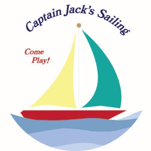
Working with the Pen Tool
This project also started as a template. I had to trace the front and rear sails with the pen tool and add a color fill. I had to also trace the wave layers and the boat. After doing so, I had to draw a circle around the boat keeping it centered, and using the Pathfinder panel, crop out the rest of the logo to give it this circular look.
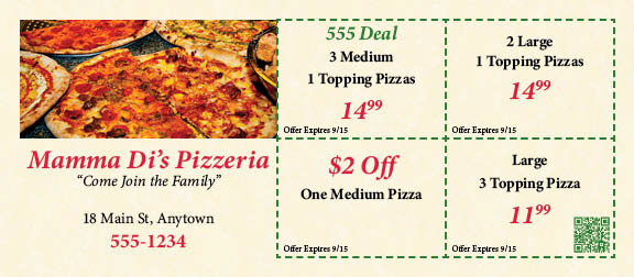
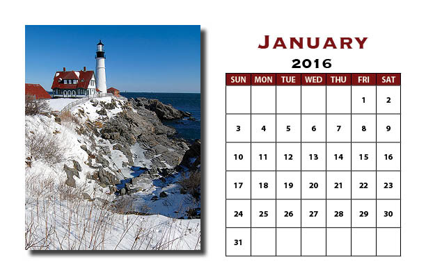
These were created in Adobe InDesign as Multipage Documents.
The coupon for Mamma Di's Pizzeria had several steps to complete, like making all of the squares for the different bits of information, the various type sizes and fonts, pasting in the image of pizza, and the creation of the QR code. The project was very informative, and fun to make. It made me very hungry while creating it.
The other project is a multipage calendar containing an image of a lighthouse, and January 2016. This project required building a table from scratch, and making the rows all identical. To keep everything straight, I had to create invisible guidelines from the rulers that help guide you as you're designing on InDesign.
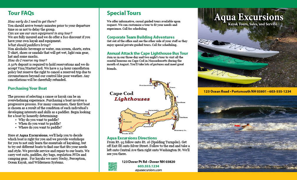
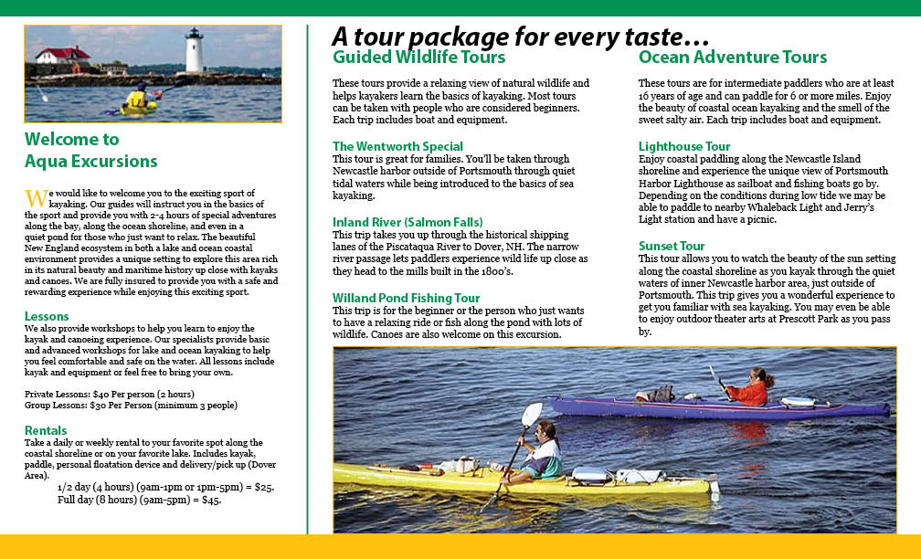
This brochure was created in InDesign.
An Aqua Excursions ad for an adventurer and sight seer. This assignment was created from scratch with files provided by the instructor. This assignment taught me a lot on making brochures that I can use in the future for church events and other projects.
The following projects were created for GCOM 2673 at Arkansas State University. Each of the projects were created or edited using Adobe Photoshop.
Project 1
This project was assigned directly from our text book. We worked with numerous types of selection to grab the objects placed onto the picture frame. We were also given only one screw head, so we had to duplicate and place it in the corners.
Project 2
This was our second project for the course. We had to design a magazine cover with the given type and layouts provided in the textbook. The only variation from the book that we had to make, we had to use a photo of ourselves. In this assignment, we learned about the puppet warp feature. My head was looking straight, but I had to warp the photo to make myself look upward. We also had to create the background logos from scratch using two types of polygons.
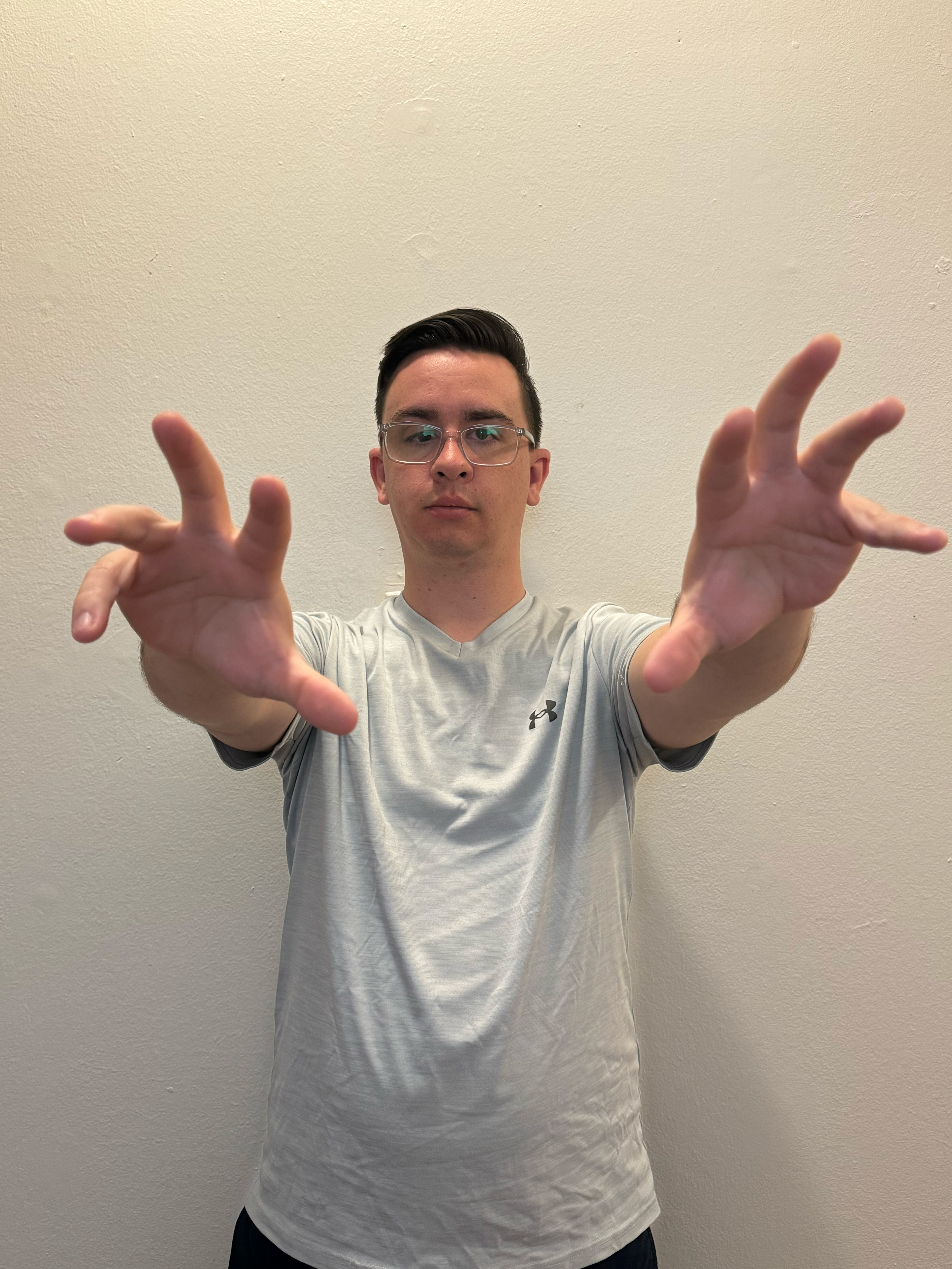
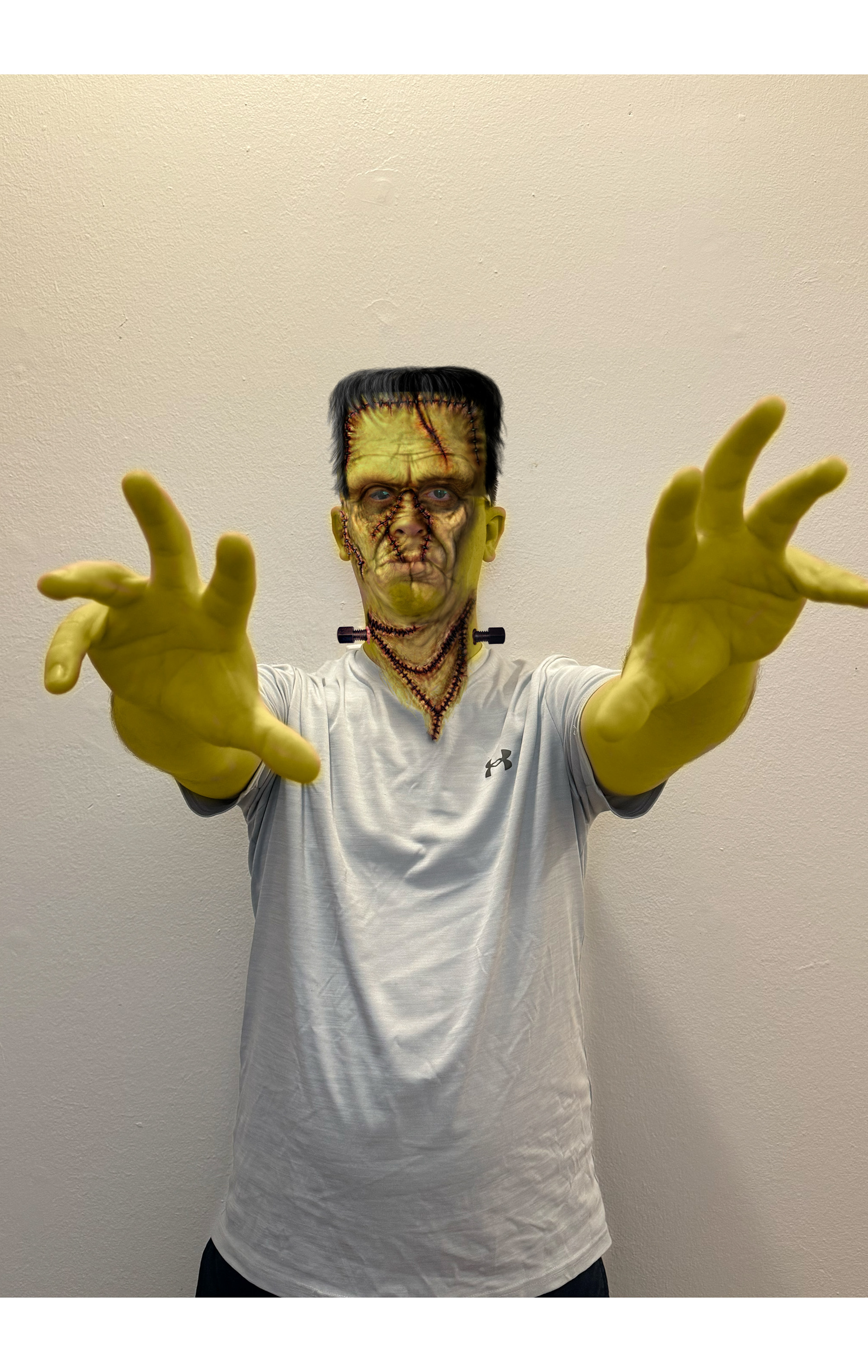
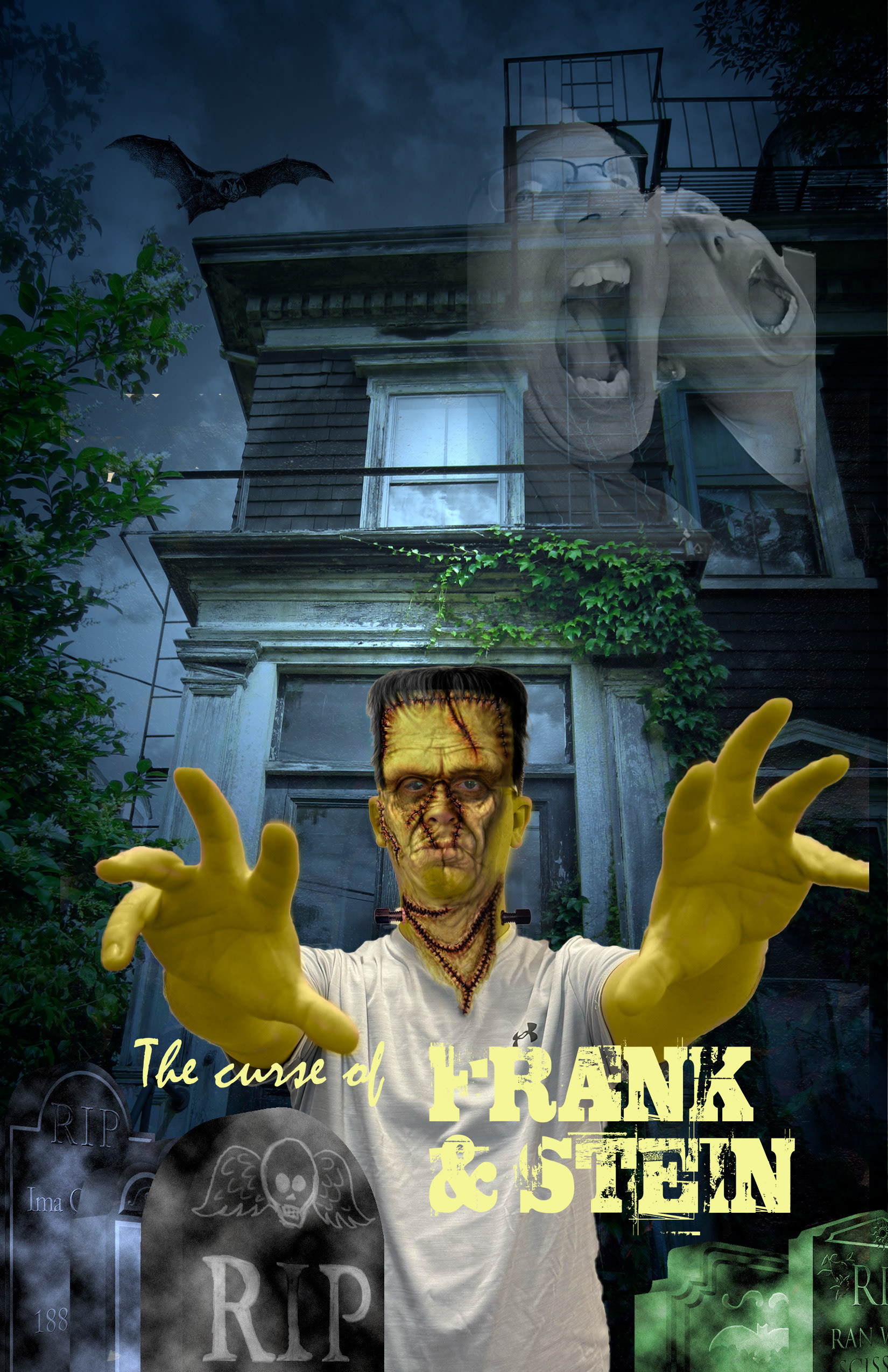
Project 3
This assignment was one of my favorites! We, again, used ourselves, to make the project. This is a poster for Frank & Stein. I liked the project, because we learned how to use layers to change the color of an object after it's selected. The learned features from this assignment have already come in handy with a project I had to do for church. This one was fun!
Project 4
This was our first "off book" assignment. We had to use some of the elements of Photoshop learned throughout the first few weeks to complete this project. Ice Typography was fun, but one of the more challenging for me. It took me several attempts to get the effect of "ice". This one required 3 layers of my initials. One is the reflected layer, one is an aluminum layer giving it the crinkled look, and the last was the liquify filter.
Project 5
This is our next to last assignment for the course, using the double exposure effect. This assignment was off book as well. It took quite a bit of extra work and exploring some of the effects of Photoshop. The project started with a side view of a this girl's face. We had to overlay the image of the city over the upper portion of her head and hair, and the reflected view of some trees over her shoulder and upper torso.
Project 6
For the final project of this class, we had to create a movie poster. We were given a list of movie titles to choose from, as well as a background photo. When I saw the nutcrackers, I instantly got "The Indian in the Cupboard" vibes. I had to make my movie poster revolve around that same idea. I did make the type for the movie title "Between The Trees" have a wood grain look, as well as a 3D effect. We were also given creative freedom for our actors and music artists, so I used some of my favorites, Matthew McConaughey, Tom Hanks, Dennis Quaid, Bijan Robinson, and Tim Hawkins, with music by TobyMac and Michael Tait. This project was daunting at first, because we didn't have any guide as far as the steps to do it. We were just given a few elements and told to begin. I saved and edited this poster numerous times until I felt I had it right. So, coming to a theater near you, someday, one day...
"Between The Trees Revenge of the Nutcrackers"
